OLS Cars imports cars from Japan: Porsche, Lamborghini, Ferrari. We built them a website in Polish and English. The project is a good excuse to write about how a website for a car importer differs from an ordinary company brochure site.
The client decides before they touch the car
In this industry, the purchase starts on a screen. The car is still sitting in Japan, or in port, while the conversation about it is already underway. So the website isn't a folder handed over after the deal, it's the place where the first decision gets made: does this company look like one you could wire large sums of money to for something you haven't seen yet.
The second thing is distance. A client from Warsaw or Berlin isn't going to drop by on their way somewhere to look at the car. So the website has to answer the questions people usually ask a salesperson over coffee in the showroom, and do it without demanding a phone number in exchange.
The third thing is pace. In the import business, the inventory changes every week, and a single car can disappear in two days. The site has to be editable fast, without a developer's help, or after six months the catalog drifts away from reality and starts hurting the business instead of helping it.
That changes the hierarchy. First, proof the company knows what it's doing. Then, actual cars. A contact form comes last. The reverse order, a big form at the top and the catalog somewhere below, is a common mistake on automotive sales sites.
A dark layout where the car is the only color
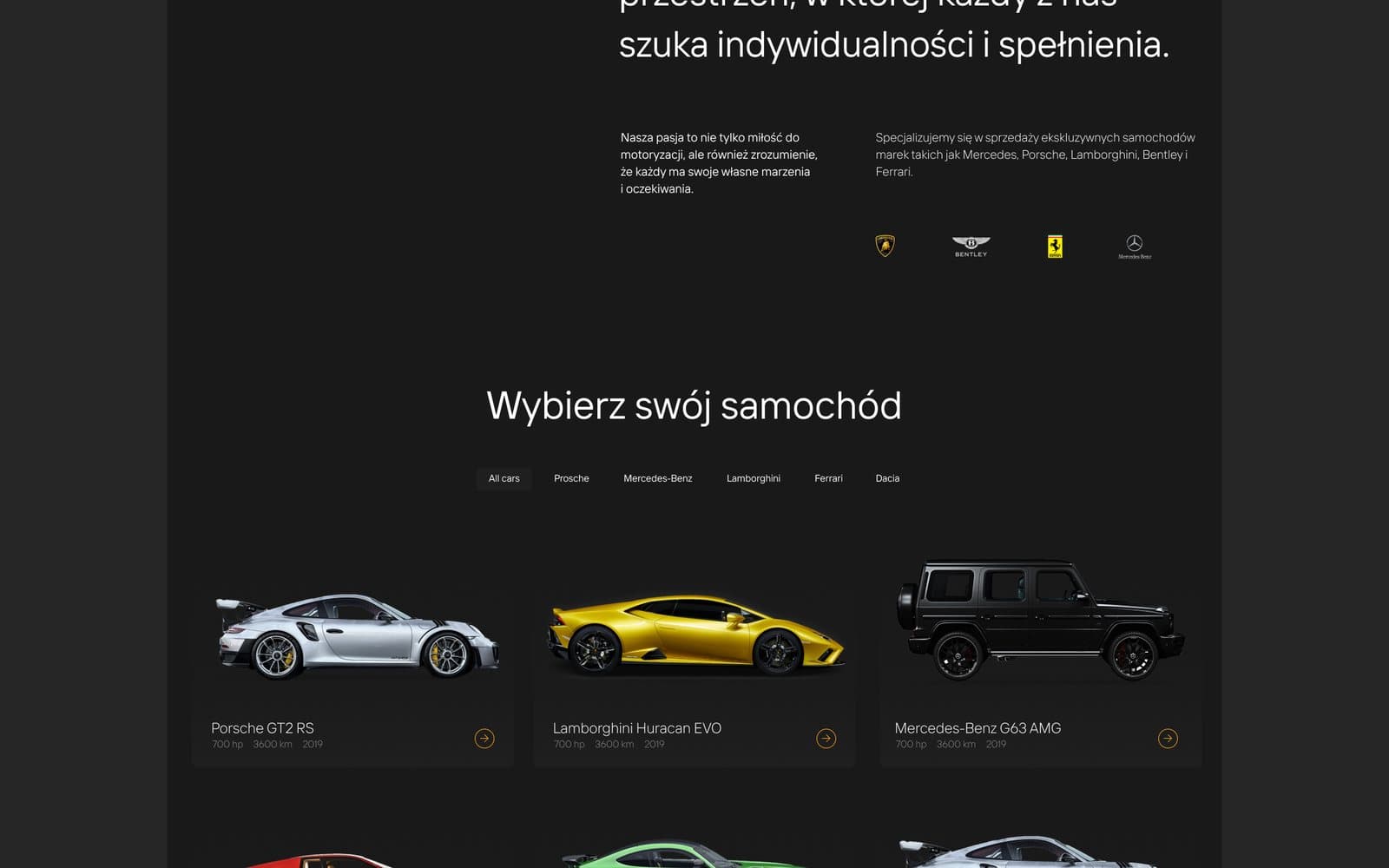
The whole OLS Cars site is dark and calm. No gradients, no accents competing with the paint job. Color comes only from the car photos: the background acts as a stage, not a second protagonist.
That's a practical decision, not an aesthetic trend. Photos in this industry vary in quality: some come from the seller in Japan, some only get taken once the car arrives. A dark background evens out those differences, because the shots sit more comfortably on it than they would on white.
A calm layout also holds up better over time. A site that doesn't shout with effects ages slower than one built around a trendy animation. After two years, you swap out the inventory, not the entire visual system.
The car page is a product, not a gallery
The most important screen on the site is the single car page. For the Ferrari 296 GTB we reworked it several times, until we landed on a layout where the first screen gives the model, year, key facts and a way to get in touch, and photos and details follow below.
A product page in the automotive world has to do two things at once. It has to sell the emotion, because nobody buys a supercar off a spreadsheet. And it has to answer the hard questions: mileage, history, condition, exactly what's included in the import price. Skip that second layer and you end up with calls where a salesperson spends half an hour reading out data over the phone.
What's left off the page matters too. We don't list twenty specs, because someone buying a Ferrari isn't comparing trunk capacity. What stays is the data that actually weighs on the decision, plus a clear note on what stage of the import process the car is at.
The catalog above the cards got filters by make. With a few dozen listings that's enough, and at a few hundred it can be expanded without rebuilding the site, because the data structure was built from day one to handle growth.
Two languages from day one, not a year later
The site has a Polish and an English version. Language versions are usually the thing projects put off, because "Polish is enough for now." Adding a second language later means rewriting components, because the text is hardcoded into the code and the layouts break under longer sentences.
That's why we build for two languages from the start, even if the client only launches one version at first. Content lives separately from code, URLs get a language prefix, and search engines are told about the alternate versions. For an importer who also sells outside Poland, that's not a nice extra, it's part of the offer.
Two languages also means remembering things that are easy to overlook: the contact form, error messages, the confirmation email, and the descriptions that show up in search results. A page with an English headline and a Polish validation message looks unfinished at exactly the moment the client is closest to reaching out.
Speed is part of the image
Automotive websites are heavy by nature: lots of high-resolution photos, often background video. We build them in Next.js, with server-side rendering, modern image formats, and photos that load only as they approach the viewport.
The result is simple to describe: the catalog opens right away, not after three seconds of gray background. For a premium listing, that matters for the brand's image. A slow site tells the client the company cuts corners, even when the real cause was just uncompressed photos.
SEO benefits along the way too, since speed and clean site structure are part of how search engines rank a page today. We treat that as a side effect of good work, not a separate service to upsell.
The biggest savings in projects like this, by the way, sit in the photos, not the code. A single shot straight off a camera can weigh as much as the rest of the site combined. That's why we plan photo prep together with the build, instead of leaving the client to upload the catalog on their own.
Trust: the "why us" section, reviews, FAQ
In car importing, the biggest barrier isn't price, it's risk. Clients ask the same questions: what about the car's history, who's responsible for transport, how does customs clearance work, what happens if the condition turns out different from the photos.
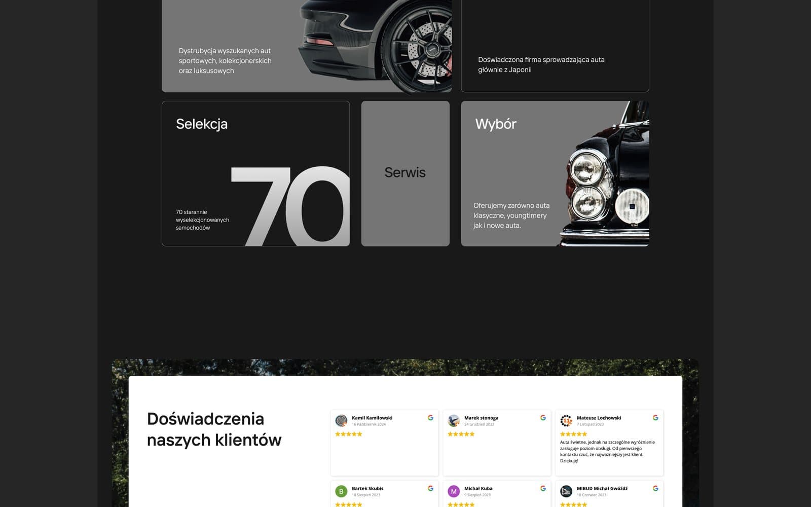
Those questions are answered on the site directly. The "why us" section explains the import process, reviews show real people who've already been through it, and the FAQ picks up the rest. The payoff is twofold: the client shows up to the conversation already informed, and the salesperson isn't starting every relationship with the same lecture.
The same content also pulls its weight in search results and in AI assistant answers. It's written in the language of the questions people actually ask, so it's easy to cite. We didn't write it for the algorithm, we wrote it for the client, and that's exactly why it works.
It's also worth showing people and process. In a business where you pay upfront for a car sitting on the other side of the world, a photo of the team and a walkthrough of the import steps does more than the best-written tagline.
Beyond the website: materials that sell the same car
The project also included animated bento-layout posts in four formats, plus a logo in print and web versions. The website and social media have to show the same car in the same visual language, otherwise a client who clicks an ad gets the feeling they've landed somewhere else.
A package like that only makes sense when it comes from one place. When one company builds the website and another does the graphics, the differences in framing and typography show up in the first week of the campaign.
The same rule applies to email offers and materials for industry events. One library of shots, one set of rules, everything in one place. A salesperson doesn't have to dig through folders for a photo, they just send the finished file.
The site isn't finished once it launches either. We check which cars get the longest view times and which searches bring in traffic, then adjust the order of the catalog and the content of the FAQ section. It's work measured in quarter hours, and over a year it adds up to a real difference.
If you're planning a site for a car dealership or an import business, start with the single vehicle page and with the list of questions your salespeople hear every day. The rest of the site will fall into place around that. Get speed and a second language sorted before you need them: both cost several times more later.
We're happy to show you how this works behind the scenes and how long it takes. Just drop us a line at hello@dopest.studio.